Basic Tips for Your Wedding Color Palette.
You may already know that the decision about your wedding colors can be significant, but did you know that it is also necessary to start your journey in planning your wedding?
What is a wedding color palette?
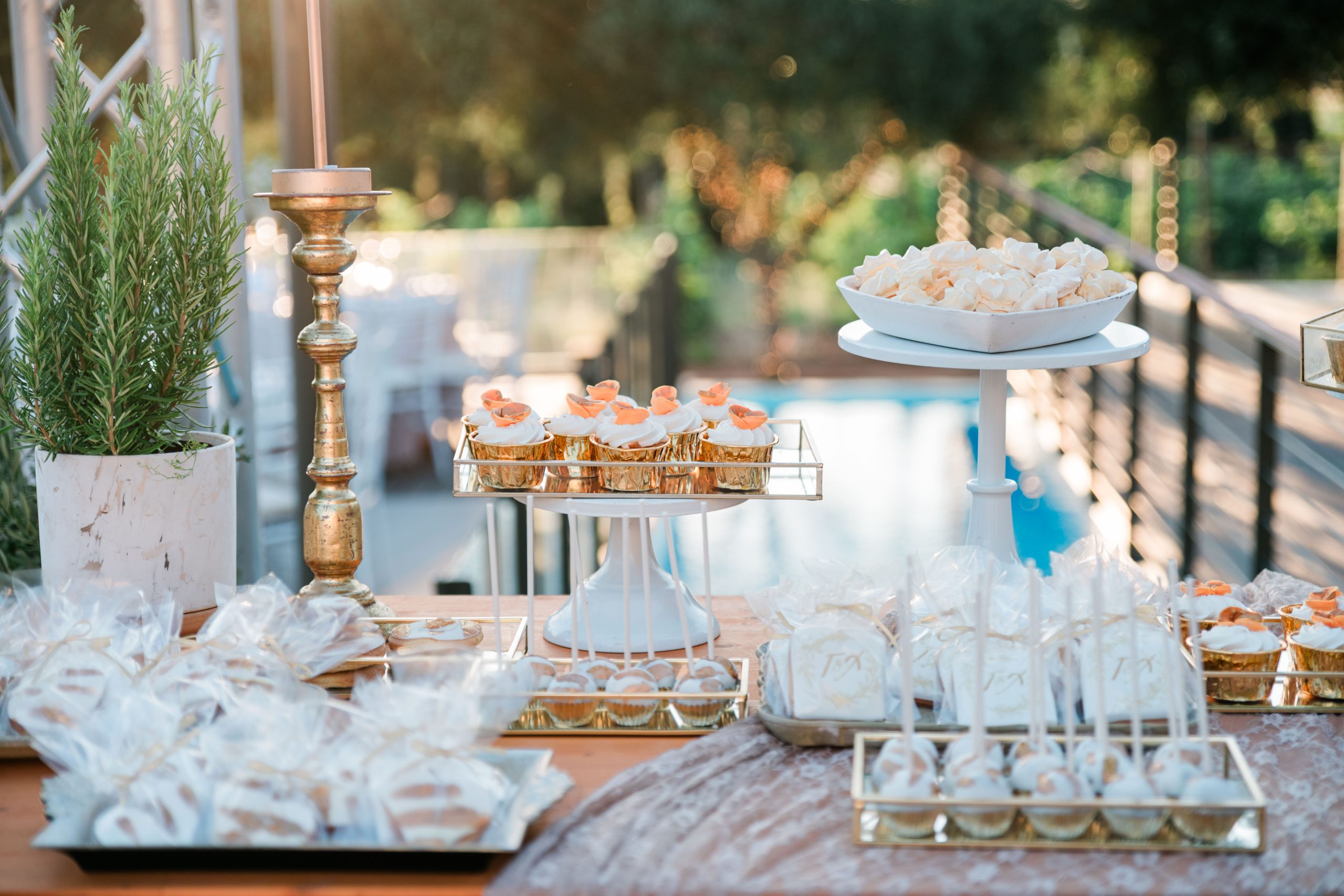
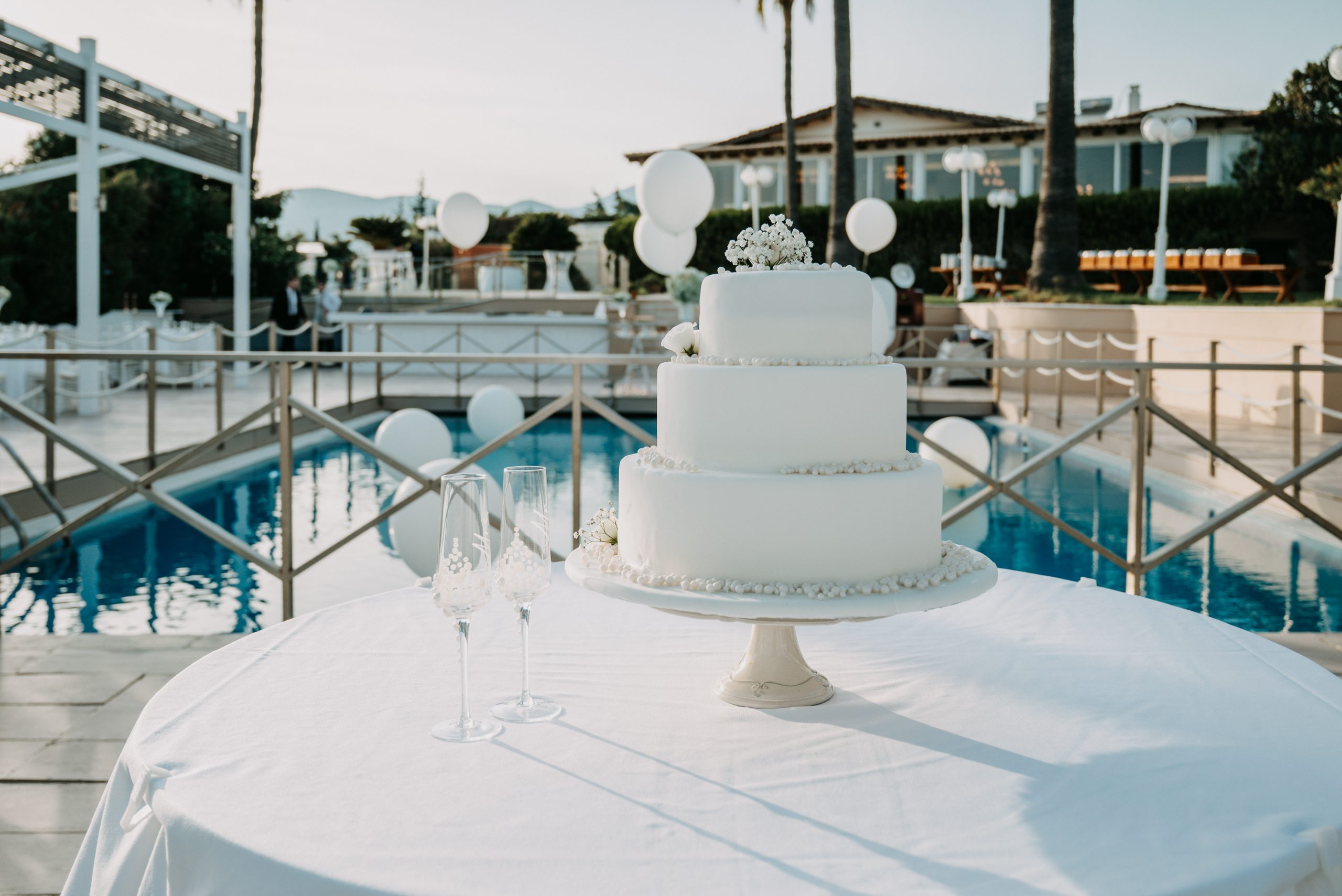
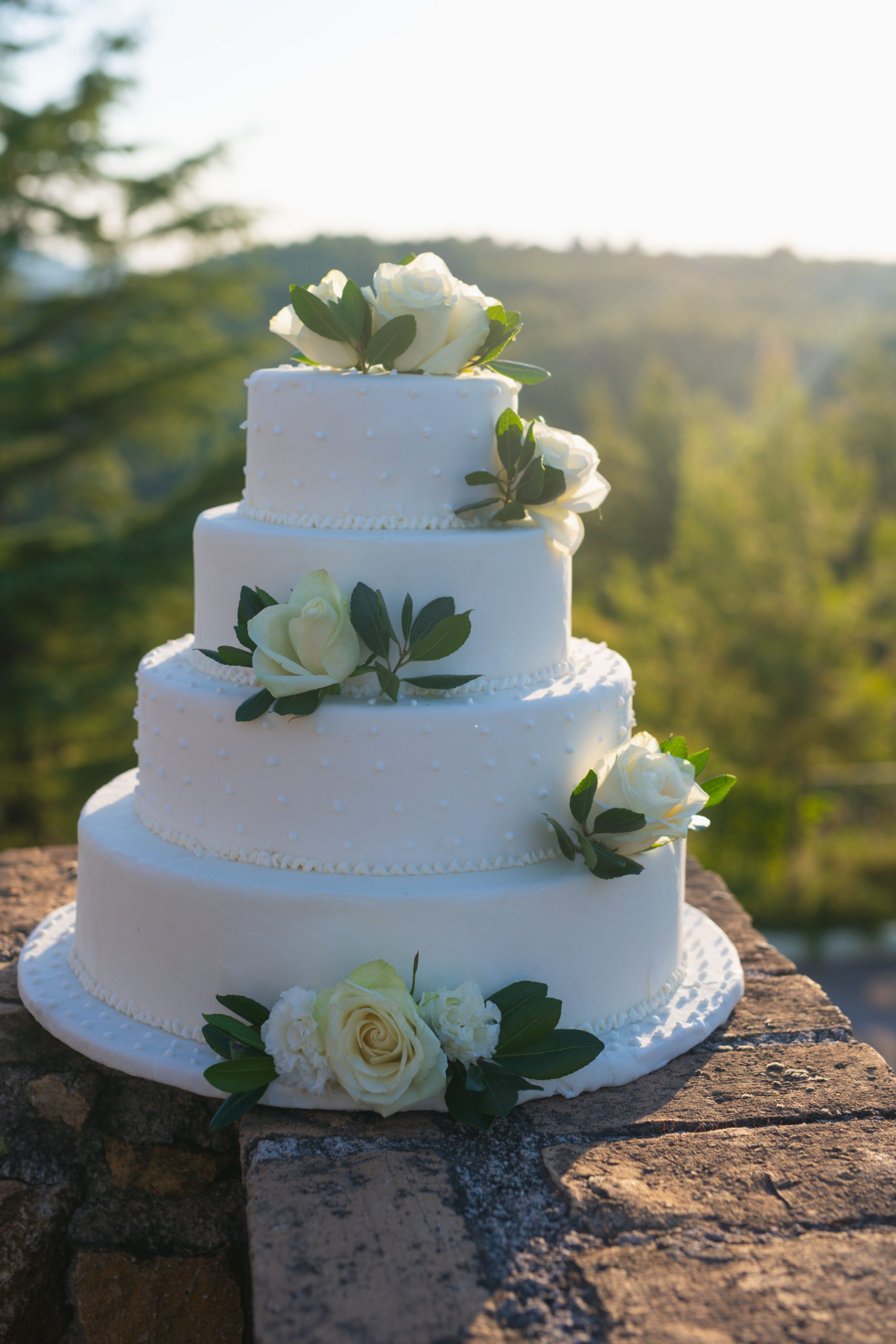
It is a collection of colors used in various ways throughout your wedding day, tying together almost every aspect of it. From the invitations to the floral arrangements, the attire, the cake design, and sometimes even the most unexpected details, like your signature cocktails or wedding favors.
Your color palette will serve as a general guide for the aesthetics of your wedding day. Here are three simple steps on how to get started.
1. Get inspired by your wedding venue
One of the most crucial points is the location. The right choice of colors that will enhance your space will highlight the decor without clashing visually. For example, if your event space is in a neutral beige tone, you might want to choose a more vibrant color for your decor to brighten up the space. If your venue is decorated with more colors, you can opt for more neutral combinations to harmonize with the existing aesthetic.
2. Don't forget your wedding must-haves
While your wedding venue significantly influences your color palette, you should also consider the favorite touches you desire that cannot be missing from your dream wedding. For example, if you've always dreamed of having wedding floral arrangements filled with sunflowers, you'll need to include yellow in your palette. Use those essential colors as a starting point, rather than trying to incorporate them into your wedding design later.
3. Think seasonally
Just like your everyday wardrobe, your wedding colors can (and should) reflect the season in which it takes place. Since it is not aesthetically pleasing to use all colors every month, the secret lies in the right adaptation. That is, if pink is the ideal color for your wedding, a soft pink tone is perfect for spring, soft lavender and silver make a beautiful winter combination, while bright coral is a staple of summer. Adding colors for emphasis can also help you lighten or darken your color palette for different seasons.